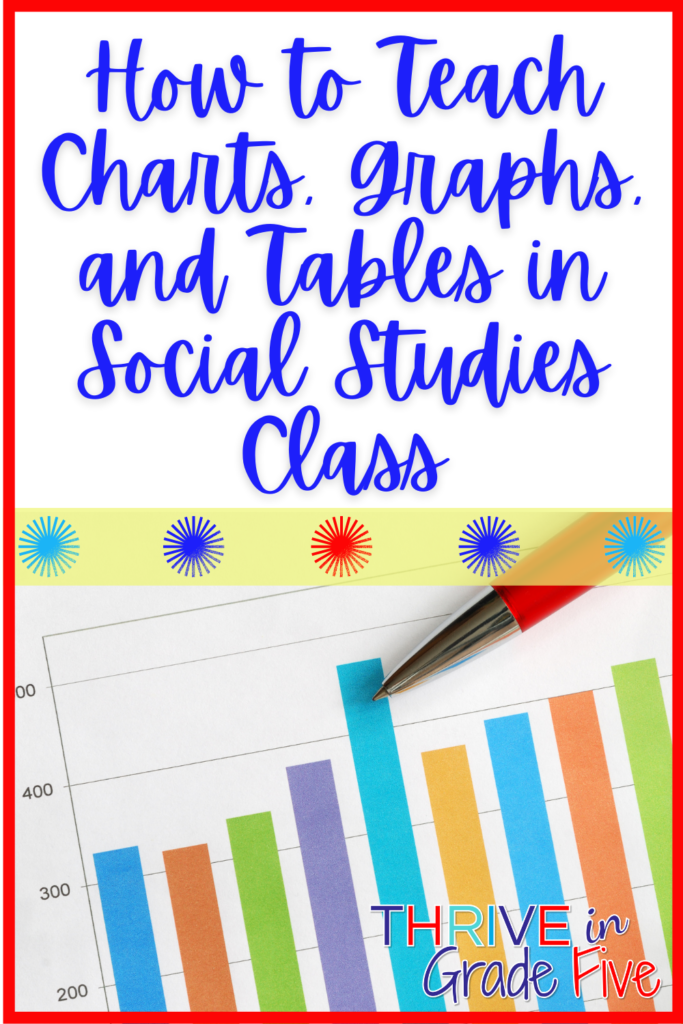
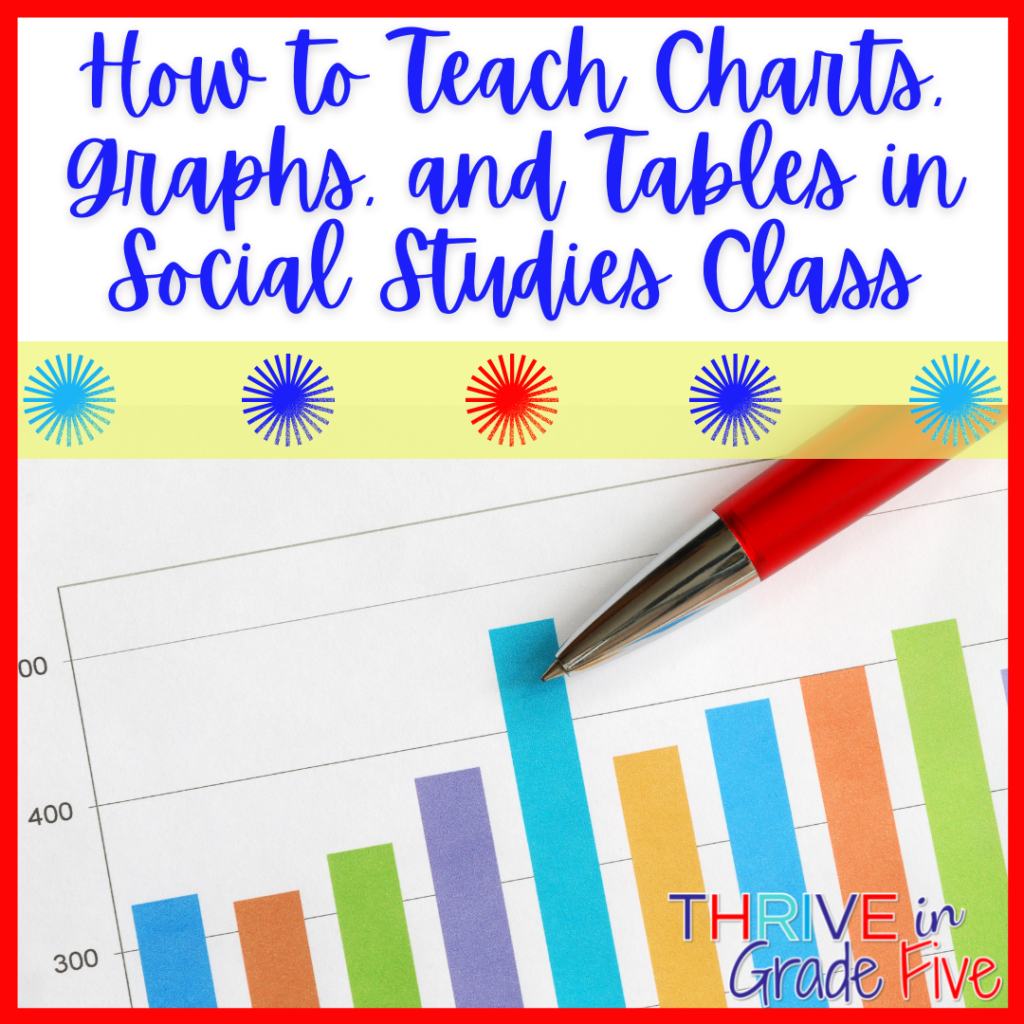
If you are working on a plan for how to teach charts, graphs, and tables in your upper elementary social studies class, you’ve come to the right place!
Charts, graphs, and tables commonly used in upper elementary social studies, along with most other subjects, include data tables, bar graphs, line graphs, circle graphs, and pictographs.
Charts and graphs are applicable to all subjects but they are commonly used to display historical concepts and data, so it’s important to me that students understand how to interpret them.
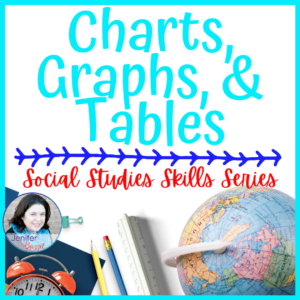
Are you looking for a ready-to-print resource for your upper elementary students? This one has it all:
My goal is for students to be able to ask AND answer higher-level questions using charts, graphs, and tables, so we do spend some time diving into, pulling apart, and discussing each type of chart, graph, and table.
Additionally, I encourage my students to CREATE multiple examples of each type of chart, graph, and table. When students are tasked with actually creating bar graphs, pictographs, and etc., they reach a deeper level of understanding and processing.
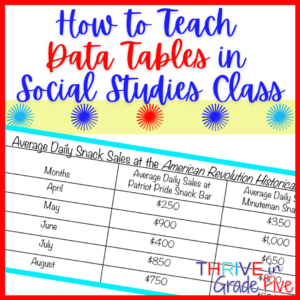
How to Teach Data Tables in Social Studies Class
Data is information in the form of numbers. Examples: distance from one place to another, numbers of items, prices, population numbers, and etc.
A data table is a visual display of data. Usually, data tables are arranged into rows and columns. This arrangement allows viewers to compare all available information easily.
What elements are important to notice on a data table?
Title – Students should pay attention to the title because it will help them to understand the information being displayed on the data table.
Categories and Data – The categories and the numbers listed within each category will help student to compare and contrast the information presented on the data table.
Teaching Students to Read Data Tables
I find that it’s helpful to display a simple data table on my technology board or write one on the whiteboard.
First, we use the title to discuss the information that will be listed on the data table.
Next, we examine the categories and how they relate to one another. For example, if months are listed on the left side of the data table and sales at a snack bar are listed on the top, we can tell that the data table is showing us the value of snack sales made at the snack bar per month.
Finally, we compare and contrast the data on the data table. Are the numbers increasing, decreasing, or holding steady? Are there outlying pieces of data or are the values fairly similar?
Quick Ideas for Assigning Student-Created Data Tables
- Ask students to create a survey in which classmates may choose their favorite from three historical individuals. At the conclusion of the survey, students should create a data table to display the information they gathered.
- Using group effort, ask students to separate classroom library books by genre. Then, allow students to create a data table to display the information.
- When the data is finalized from a school fundraiser, provide your students with the sales data by grade level or class. Ask each student to create a data table to display school fundraiser sales. You can raise or lower the complexity of this activity by how you choose to provide the data to students.
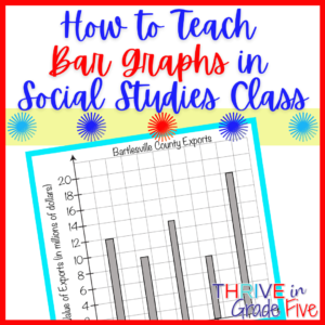
How to Teach Bar Graphs in Social Studies Class
A bar graph is a visual chart that helps us to compare different amounts using bars of various lengths. Bar graphs can be vertical (up and down) or horizontal (side to side).
Double bar graphs are used often in upper elementary books and informational articles, so I teach my students about these special graphs as well. Double bar graphs help us to compare two sets of data. Students will need to use different colors or designs on the bars to help viewers see the information clearly.
What elements are important to notice on a bar graph?
Title – Students should pay attention to the title because it will help them to understand the information being displayed on the bar graph.
Categories – Point out to students that the categories on the bar graph will explain the data being presented. I tell my students that a bar graph is useless if categories are not listed on each axis. We’d have no idea what the bars mean if there were no categories listed.
Scale and Units – Students should always make it a point to notice the scale used on the bar graph. Often, they’ll encounter bar graphs labeled with 2, 4, 6, 8, and so on. The units are critical to use when interpreting the data on the bar graph because 2 might stand for 2,000,000 and 4 might stand for 4,000,000. Big difference!
Key (Used with Double Bar Graphs) – When examining a double bar graph, students need to check the key to help them understand the meaning of each bar.
Teaching Students to Read Bar Graphs
Display a bar graph on your technology board or provide a bar graph for students to reference.
First, we discuss the title and predict how the title relates to the information displayed on the bar graph.
Second, we look closely at the categories, scale, and units to help us interpret the data on the bar graph. If we are using a double bar graph, we discuss the differences between the bars.
Finally, we compare and contrast the data on the bar graph. Are the values fairly similar or are there outlying values?
Quick Ideas for Assigning Student-Created Bar Graphs
- Single Bar Graph – Ask students to survey their classmates on favorite types of drinks and create a bar graph to display the results. It’s best to limit the survey choices to five or six so that students’ bar graphs are not too overwhelming.
- Single Bar Graph – Ask students to survey classmates to find out which school lunches they prefer.
- Double Bar Graph – Ask students to survey their classmates on favorite types of drinks. Create a double bar graph to display the responses of boys and girls.
- Double Bar Graph – Ask students to survey two different homeroom classes to find out which school lunches are preferred by students. Create a double bar graph to display the responses according to homeroom class.
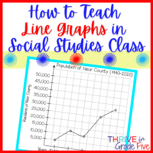
How to Teach Line Graphs in Social Studies Class
Line graphs show changes over time. This is such an important feature for students to understand because change over time is what sets a line graph apart from other types of graphs.
Double line graphs are sometimes used in upper elementary books and informational articles, so I teach my students about these special graphs as well. Double line graphs help us to compare two sets of data. Students will need to use a different color for each line to help viewers see the information clearly.
What elements are important to notice on a line graph?
Title – Students should pay attention to the title because it will help them to understand the information being displayed on the line graph.
Categories – Point out to students that the categories on the line graph will explain the data being presented on the line graph. I tell my students that a line graph is useless if categories are not listed on each axis. We’d have no idea what the data points mean if there were no categories listed.
Scale and Units – Students should always make it a point to notice the scale used on the line graph. Often, they’ll encounter line graphs labeled with 2, 4, 6, 8, and so on. The units are critical to use when interpreting the data on the line graph because 2 might stand for 2,000,000 and 4 might stand for 4,000,000. Big difference!
Key (Used with Double Line Graphs) – When examining a double line graph, students need to check the key to understand which line is being represented by each color.
Teaching Students to Read Line Graphs
You’ll notice a dot at each data point and a line connecting the dots. This line makes it easy to see trends on a line graph, like increases and decreases.
First, we discuss the title and predict how the title relates to the information displayed on the line graph.
Second, examine the categories on the horizontal axis (bottom) of the graph and the data values on the vertical axis (left side) of the graph.
Third, take note of the trends on the graph. Do the data points increase, decrease, or stay the same?
I follow the same process as above to teach double line graphs.
I tell students that we know line graphs show changes over time. Double line graphs also show changes over time. The difference between a single line graph and a double line graph is that the double line graph compares two sets of data.
Quick Ideas for Assigning Student-Created Line Graphs
- Single Line Graph – As a class, track the outdoor temperature each day for five school days. Create a class line graph to show the changes in temperature over the five school days.
- Single Line Graph – As a class, track attendance each day for five school days. Create a class line graph to show the changes in attendance numbers over the five school days.
- Double Line Graph – Track the attendance of two separate homerooms each day for five school days. Create a double line graph to display the attendance data according to homeroom class.
- Double Line Graph – Using a reliable source, find out how much rainfall your state or region has had each month for the last six months. Find rainfall data for another state or region as well. Ask students to use this data to create a double line graph. Remind students to include a key to show which state or region is represented by each line.
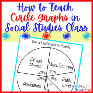
How to Teach Circle Graphs in Social Studies Class
Circle graphs, sometimes called pie graphs, use a full circle to show parts of a whole.
For example, if you wanted to show how a person spent $500, you might make a circle graph to show each amount of money spent as part of the whole $500.
What elements are important to notice on a circle graph?
Title – Students should pay attention to the title because it will help them to understand the information being displayed on the circle graph.
Section Sizes and Labels – Because one entire circle is ‘one whole,’ the pieces indicate how much of the whole is being used. The labels tell us the topics of each of the sections on the circle graph.
Key (if applicable) – Some circle graphs use a key to indicate the label of each section, so I do tell students to look for a key. Many circle graphs, however, simply have a label for each section printed inside the section.
Teaching Students to Read Circle Graphs
Note for teachers – Circle graphs often rely on percentages. My 5th graders start to learn about percentages in math class toward the end of the school year but we need to know how to read circle graphs much earlier. So, I work around this percentage issue by having pre-made circle graphs available for students so that they know the size of each section and will only need to label the sections.
First, we discuss the title and predict how the title relates to the information displayed on the circle graph.
Second, we compare the size of each section of the circle graph. Larger sections mean larger amounts and smaller sections mean smaller amounts.
Finally, we compare and contrast the data shown on the circle graph and talk about what the data means. How do the categories relate to one another? Does the data support what we already know or believe?
Quick Ideas for Assigning Student-Created Circle Graphs
Keep in mind that circle graphs use a full circle to show parts of a whole. So, we can use any ‘whole divided into parts’ data to make circle graphs.
- Tell students to pretend they won $1,000 in a contest. They must create a circle graph to show how they would spend the entire $1,000.
- Because bar graphs are common in social studies literature/textbooks, ask students to convert the data from an appropriate bar graph into a circle graph. Remember, calculate the total number first and then create the circle graph.
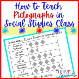
How to Teach Pictographs in Social Studies Class
Pictographs use pictures to display data.
Students enjoy creating pictographs because they have so much fun drawing the pictures!
What elements are important to notice on a pictograph?
Title – Students should pay attention to the title because it will help them to understand the information being displayed on the pictograph.
Categories – The categories on the pictograph are important to notice because they indicate the specific information being displayed on the pictograph.
Key – Each picture represents a number value, so students need to look closely at the pictograph’s key.
Teaching Students to Read Pictographs
First, we use the title to discuss the information that will be displayed on the pictograph.
Second, we look at the key. I point out to students every.single.time we look at a pictograph that the key is the most important part of the pictograph. Students need to know that if a symbol is divided in half, you will need to divide the symbol’s value by half.
Third, we calculate the value displayed for each category.
Finally, we compare and contrast the data on the pictograph. Which category is largest? Smallest? What is the difference between the largest category and the smallest category?
Quick Ideas for Assigning Student-Created Pictographs
- Ask students to survey their classmates to find out how they get home from school. Students will create a pictograph to display the information.
- Using chart paper, have students create a class pictograph showing the hair or eye color of each student. Allow each student to draw the symbol on the pictograph to represent his/her own hair or eye color.
- Allow each student to create a fictional story that includes at least four categories of data. Each student must include a pictograph with his/her fictional story.
Are you looking for a ready-to-print resource for your upper elementary students? This one has it all:
Are you looking for more upper elementary social studies/writing resources and ideas? I’d love for you to join my weekly VIP email club with no spam, just helpful tips, ideas, and resources!